TINS DERM
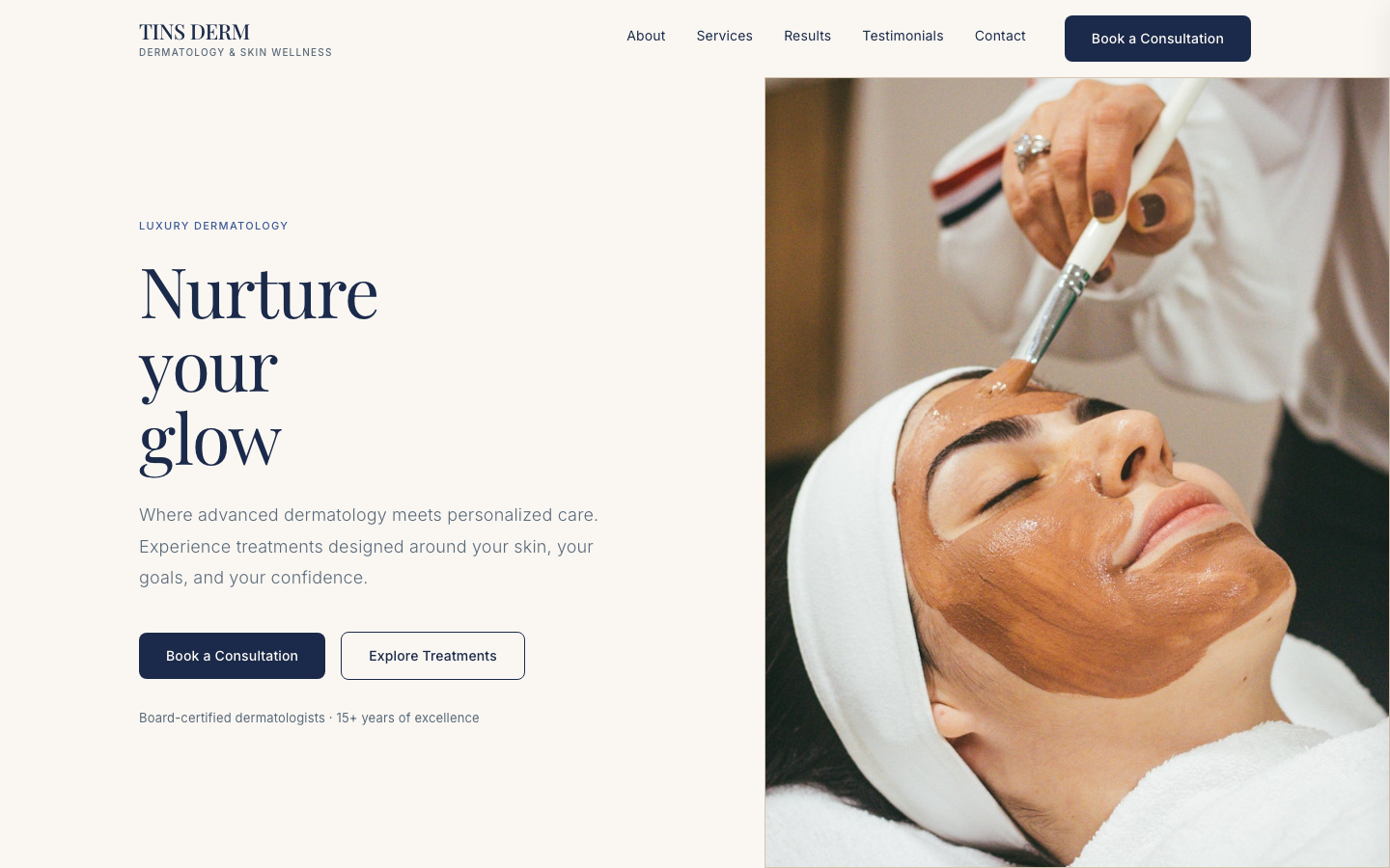
A dermatology practice's website should feel as trustworthy and precise as the care it provides.
The challenge
This one started as a self-directed design challenge, not a client brief: take a fictional luxury dermatology practice from a written brand brief to a fully designed, responsive, production-quality homepage, on my own, end to end. No client to ask, no existing brand to lean on. The constraint was the point: it forced real decisions about tone, hierarchy, and trust with nothing to fall back on.
The brief
TINS DERM needed a site that could do two things at once: reassure patients weighing a medical decision, and sell the aesthetic outcomes of cosmetic treatments. Most dermatology sites lean too clinical or too glossy. I set out to design something that held both registers without feeling split in two, working from a strict brand brief: a navy-and-gold palette, an editorial serif paired with a clinical sans, and an explicit 'no generic SaaS gradients, no stock-photo placeholders' rule to keep the craft honest.
The homepage, section by section
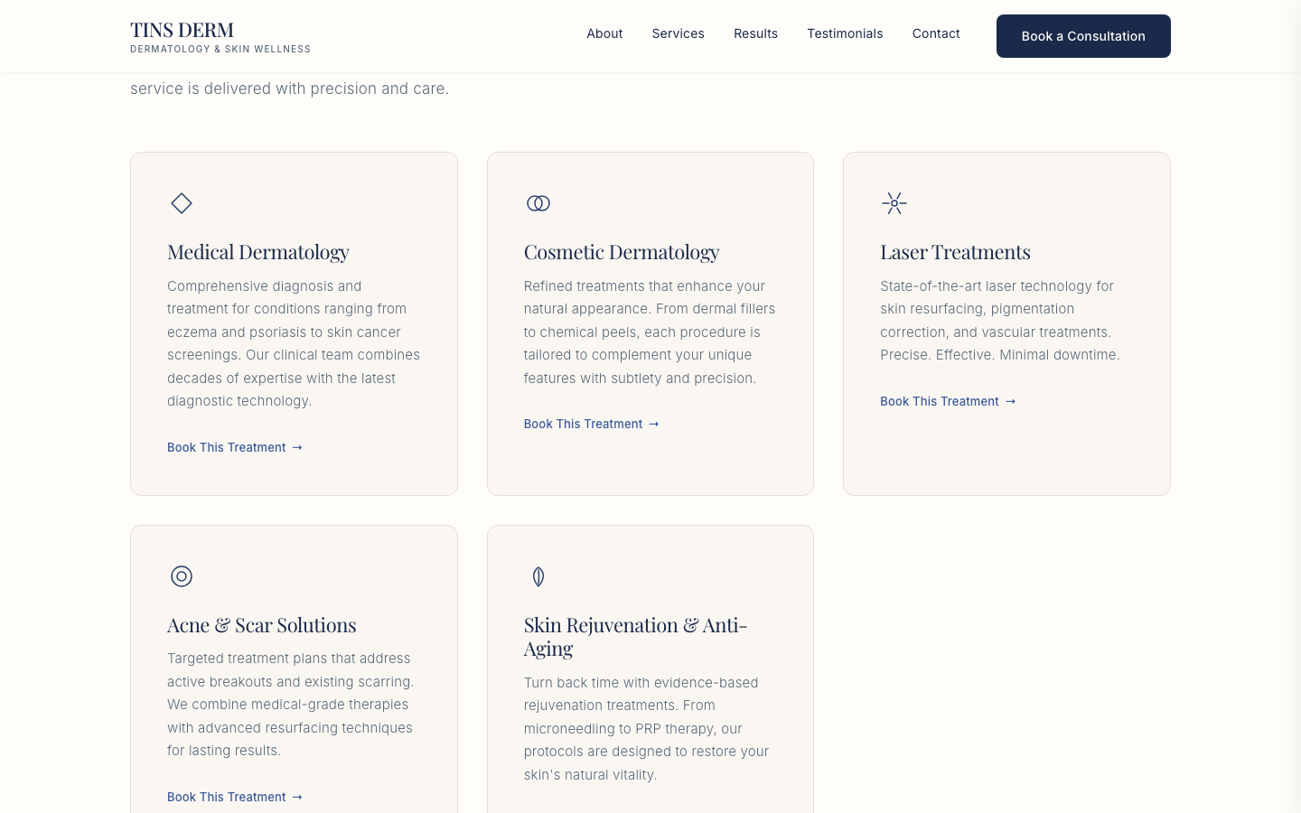
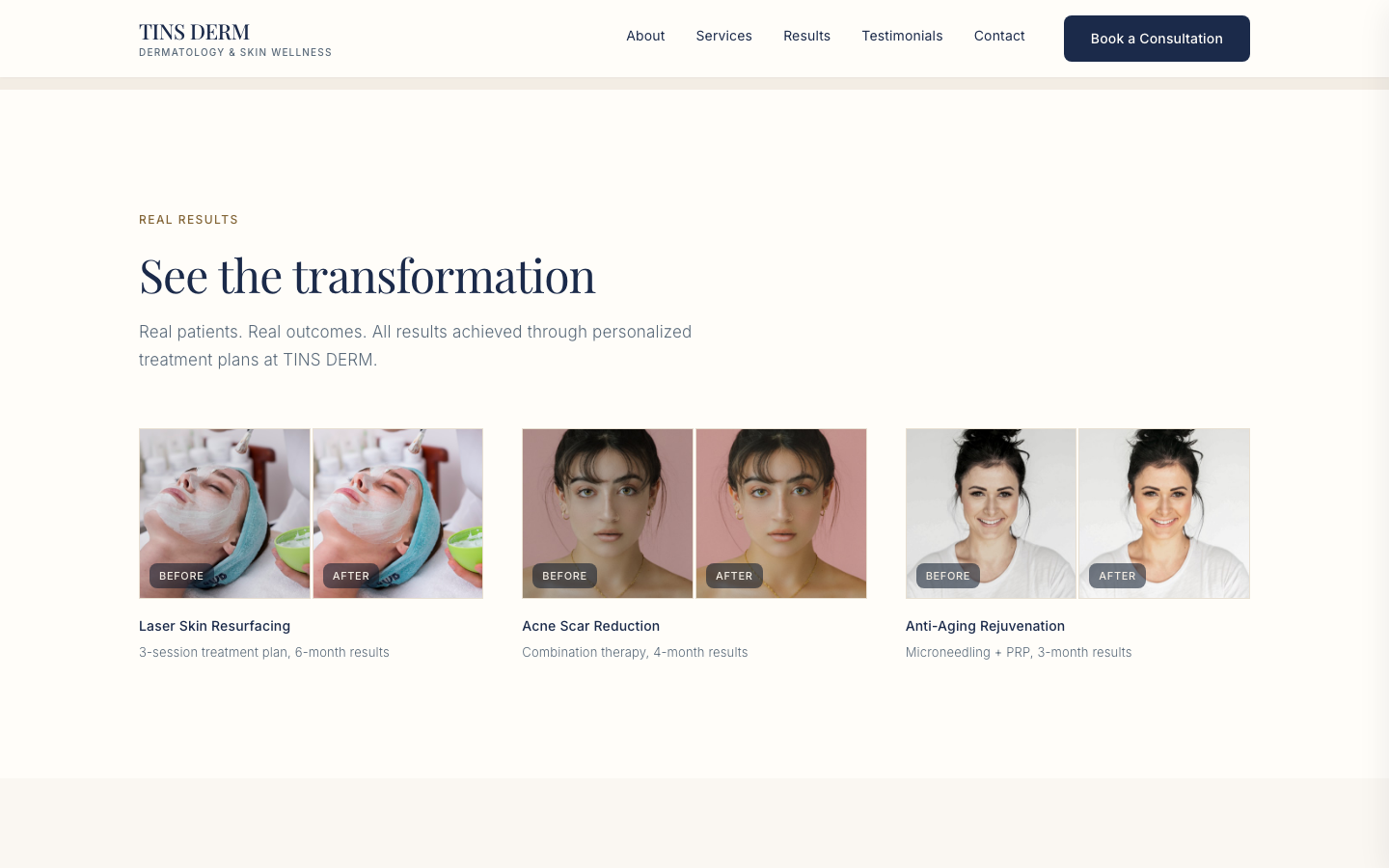
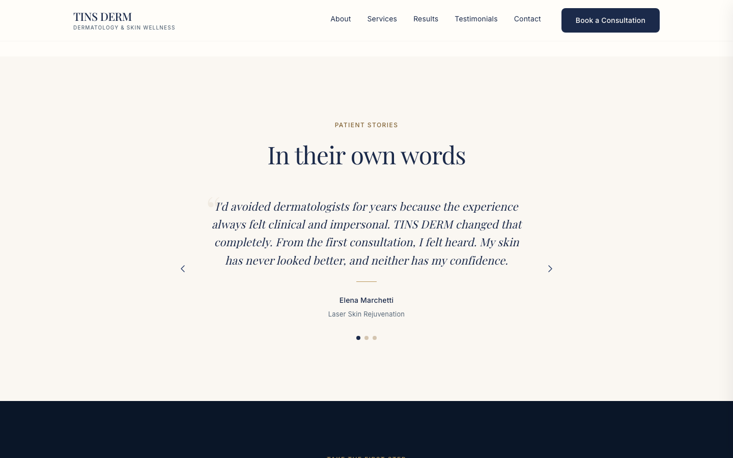
The 9 build phases
I structured the build as a sequence of phases, each one reviewed and refined before moving to the next: design system first, then layout by layout, ending with a full responsiveness and motion pass.
- 00
Design system foundation
Color tokens, typography scale (Playfair Display + Inter), spacing system, and shadow levels, all defined before a single screen was built.
- 01
Navigation + hero
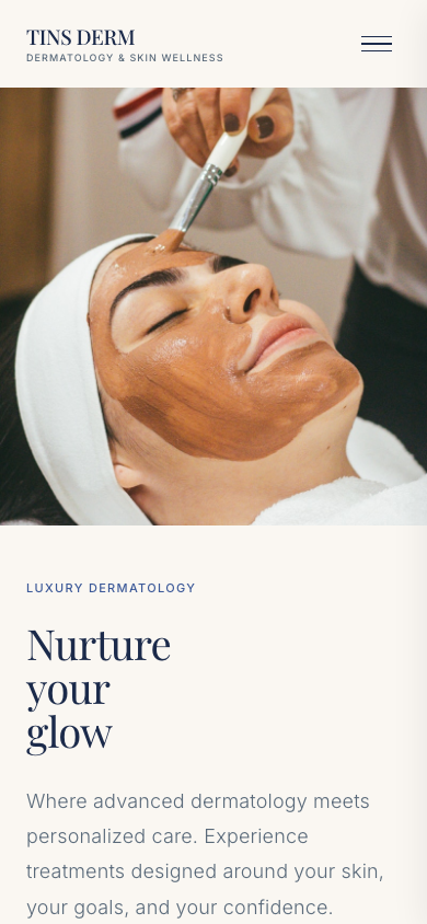
Editorial, asymmetric hero layout with a real photograph, not a centered SaaS-style headline. Set the tone for the rest of the site.
- 02
Trust bar + about
Credibility stats and a magazine-style brand story to establish authority before asking for anything.
- 03
Services
A 5-card grid with restrained line-icons, built to scan fast without feeling like a generic pricing table.
- 04
Featured treatment
A full-bleed editorial break in the page rhythm: the one section designed to feel different from everything around it.
- 05
Why choose us + before/after gallery
Proof over claims: real before/after pairs do more persuading than another paragraph of copy ever could.
- 06
Testimonials + booking CTA
Patient voices, then a single unambiguous next step: book a consultation.
- 07
Footer
Full site map, contact details, and hours: the practical information patients look for last.
- 08
Polish, responsiveness & motion
IntersectionObserver-driven reveal animations, a full tablet/mobile pass, and a final accessibility and contrast check.
Research & discovery
I audited dermatology and medical-spa competitors, mapped the patient journey from first symptom search to booked consultation, and identified where trust breaks down: vague credentials, no visible before/afters, buried contact info.
Design system first
Before any screen, I built the token set: a warm ink/gold palette, a serif for editorial trust paired with a clean sans for clinical clarity, and an 8px spacing scale, so every section stayed consistent as the page grew.
Key decisions
Real before/after photography does the persuading, not copy, so the results section leads with proof. Navy and gold signal medical credibility without feeling cold. A single persistent 'Book a Consultation' CTA removes any ambiguity about the next step.
Responsive approach
Designed desktop-first given the research showing most consultation bookings start on desktop during work hours, then adapted the card grids and navigation down to tablet and mobile without losing the before/after emphasis.
Result
The finished site balances clinical trust with cosmetic aspiration: patients can find credentials and treatment details fast, while the gallery and testimonials show what's possible. Built end-to-end as a single-file React prototype, then documented into a full case study on its own design process.