Coderhouse Redesign
The interesting work wasn't designing the new platform. It was understanding the old one.
The project
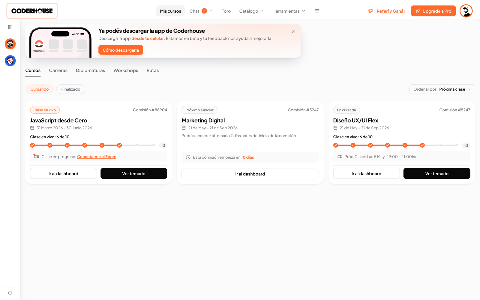
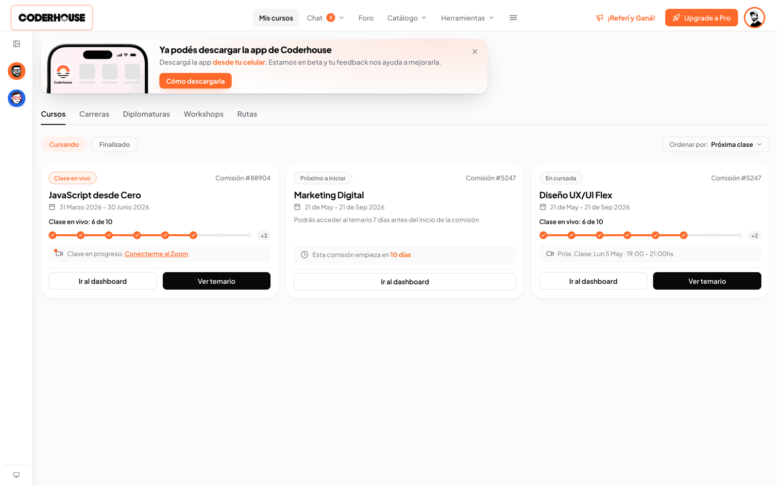
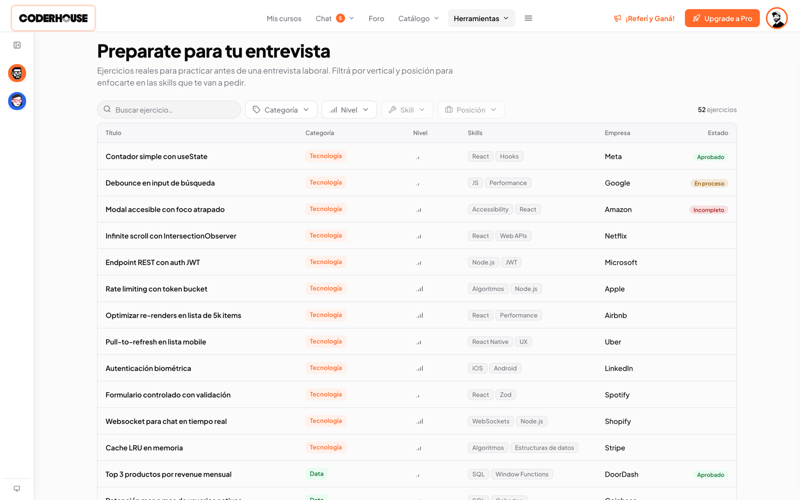
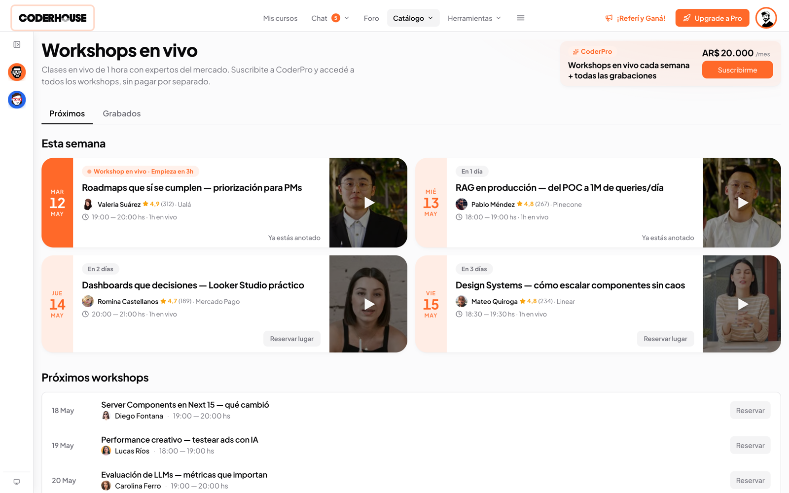
Coderhouse rebuilt its education platform from scratch. I was the only designer on the project: student campus and staff portal, two surfaces and two study modalities, on top of a design system built on Shadcn/UI rather than from zero.
The work split into two threads that ran in parallel for 16 months: separating what was actually working in the old platform from what was failing by design, and integrating AI into the core of the experience while what it could do kept shifting every three months.
Reading the old platform
Years of use, active cohorts, support tickets, ratings, NPS data: not a blank page. The diagnosis split cleanly into what to protect and what to fix.
What we chose to keep
This is the part of a diagnosis that almost never gets told, and it's the one that matters most: in a full redesign, the temptation is to change everything. What you keep with intention is a design decision as much as what you change.
A step-by-step syllabus
Content unlocks in a fixed order, one topic at a time. Removing that structure for the sake of flexibility would have removed the thing that told students what to do next.
A cohort chat between students and teacher
A single thread per cohort where students and the teacher talk directly, not just office hours. Questions get answered in public, and future students can find them.
Tutors as human support
When there's a person, there's someone to ask. That doesn't get replaced, it gets complemented.
The ranking as a status space
The need to showcase achievements is real. The problem wasn't the ranking itself: it was its rules.
What we decided to change
Five decisions, not a full teardown. Some were structural, some were about how the product looked and felt, and both mattered.
Attendance over learning
Attendance requirements punish async learners and reward leaving Zoom open. Removed attendance. You certify by content consumed + project approved.
No one to ask when you got stuck
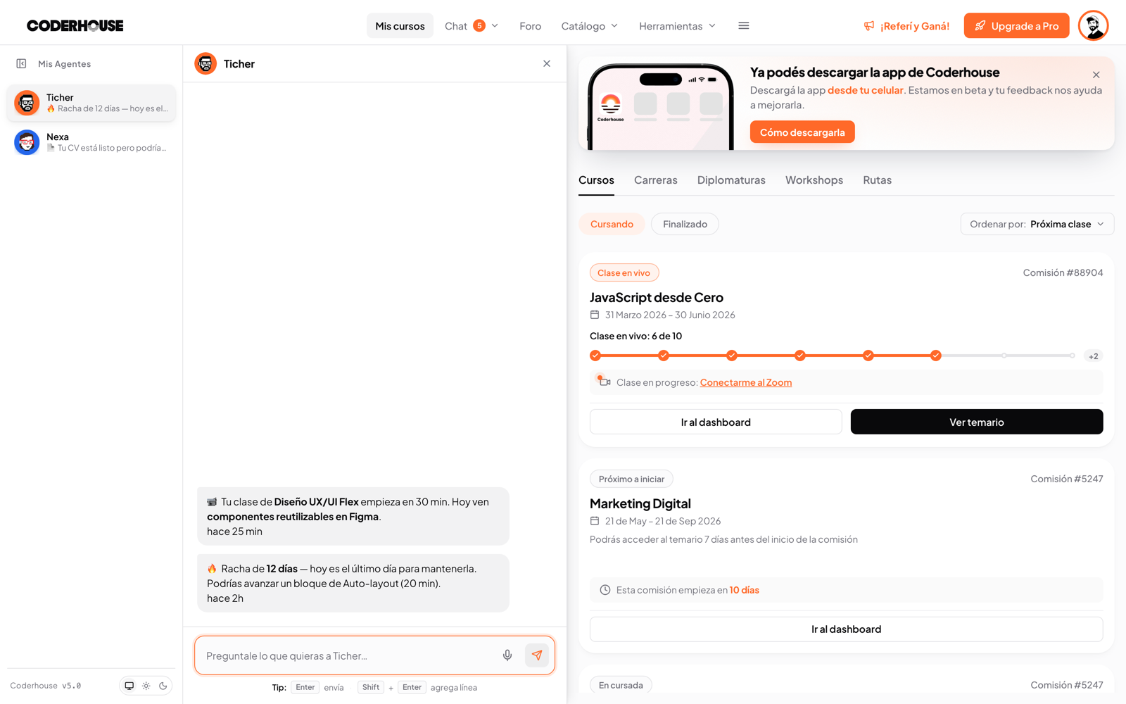
Corrections read as a closed verdict, with nowhere to ask 'but why?' In a moment where AI could actually help with that, we introduced Ticher: an AI tutor that answers doubts as they come up, deep-linked from every correction.
Confusing navigation
A hierarchy and typographic rhythm problem, not a content problem. Redesigned the syllabus and reading experience.
Support tickets from friction
No structured way to report, no separation between 'this is broken' and 'I don't like this'. Built a dual-stream feedback system.
A dated, inconsistent look
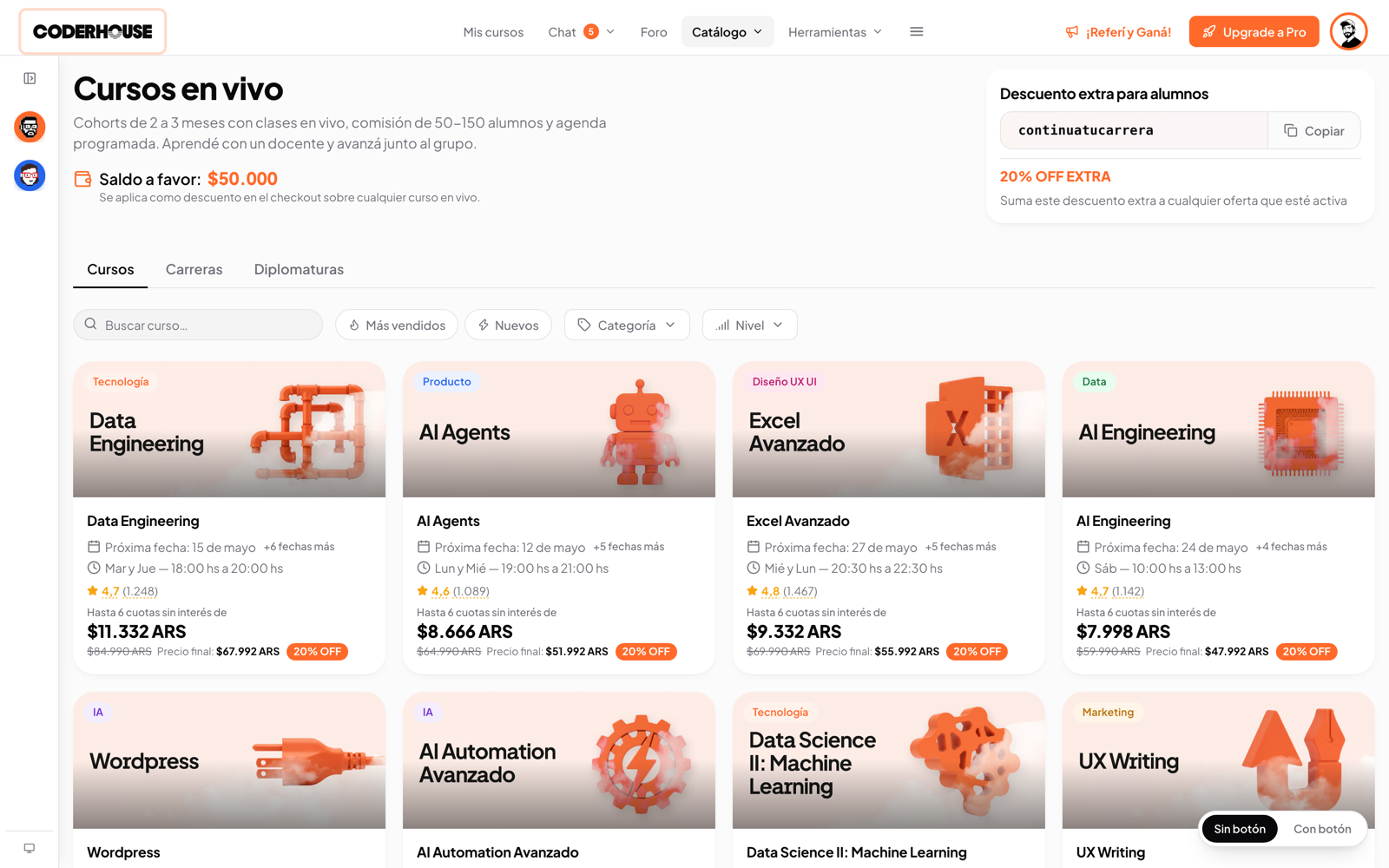
Every surface felt like a slightly different product, and the brand hadn't been refreshed in years. Paisanos led the brand refresh; I redesigned the interface on top of it, one visual language and one component system, applied consistently across the platform.
The platform
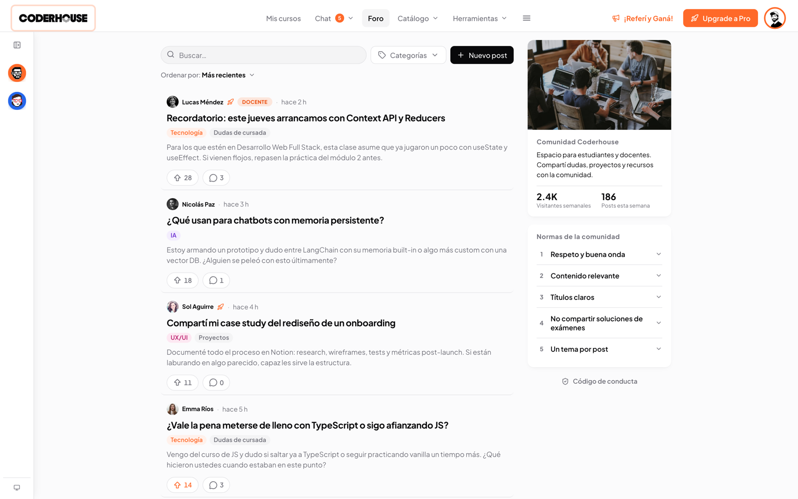
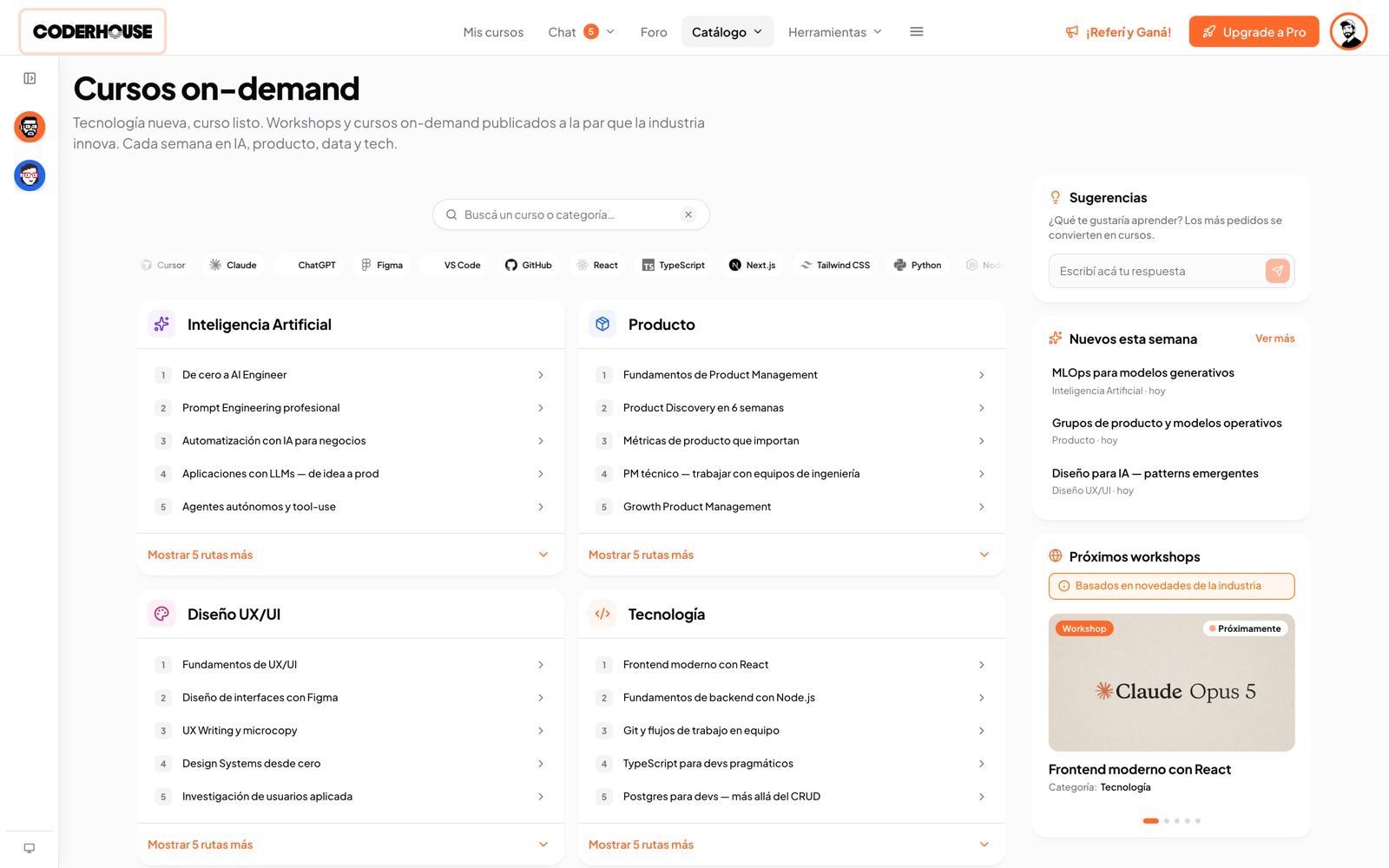
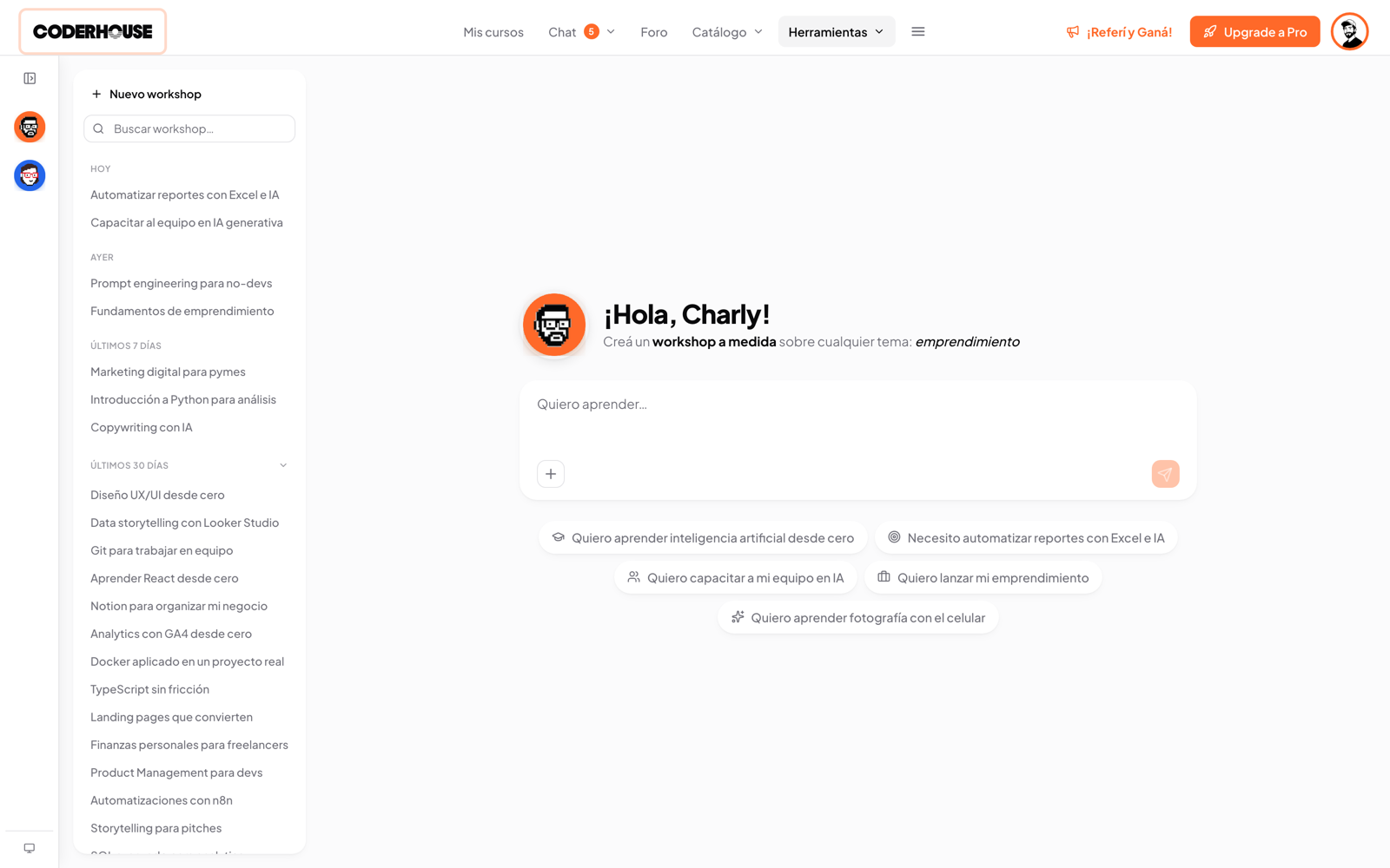
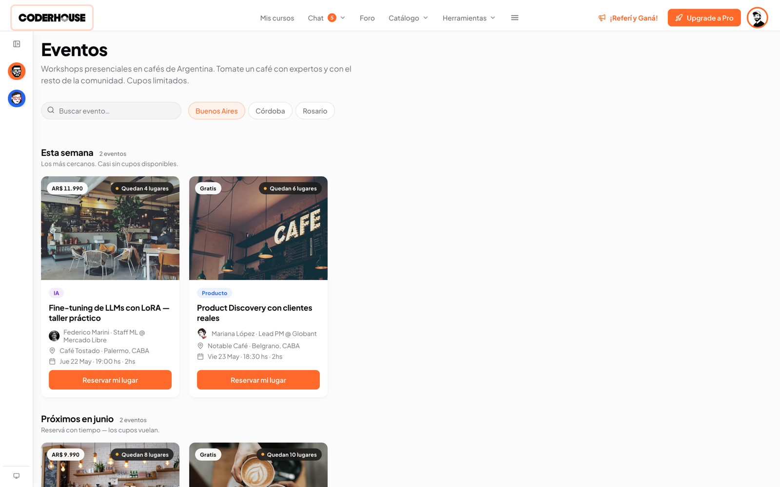
Designing AI on shifting ground
This is the part of the project that taught me the most, and the hardest to have done well. I started designing AI in June 2025. What a model could reliably do in June 2025 wasn't what it could do in January 2026, or June 2026. I was designing on a material whose properties changed every three months.
The rule that ordered everything
AI sped up process and iteration. It never replaced the judgment. I decided not to design screens that depended on how good the model was: I designed surfaces of entry (where and when the student encounters the AI) and let the quality of the output be a variable that could improve without forcing me to redesign. That call came from years of design practice, the perception and intuition a model doesn't have, and every output was still measured against it and against direct human feedback.
How AI decisions actually got made
Using AI to generate a first draft didn't mean shipping the first draft. Every AI touchpoint in the product went through the same three checks before it reached a student.
AI proposed, the team argued
Course programs, correction structures, and copy started as AI output. Nothing shipped without the team pulling it apart first.
Human feedback, every time
Every generated draft went through a person before publishing: an admin reviewing a course program, a reviewer checking a correction structure, a lead reading the copy.
Anchored to industry standards
When the team disagreed on a call, the tie-breaker wasn't personal taste, it was how established ed-tech and SaaS products handled the same problem. Mobbin benchmarking and existing UX conventions set the bar AI output had to clear.
The feedback system
The platform launched and migrated at the end of 2025. I designed a listening system built on NPS surveys, direct in-app feedback, and Intercom, with every signal routed through PostHog and organized by category. That let the team spot a recurring issue fast and turn it into a fix, every week.
Two streams, not a catch-all
The feedback sidebar splits into 'report a bug' (comment only) and 'rate the platform' (1-5 stars + comment). Bugs and experience complaints are different things: they go to different teams, and mixed together, neither can be analyzed.
Low ratings that produce backlog
If the student rates ≤3 stars, actionable improvement categories appear. A 2-star rating without a category is noise. With a category, it's a task.
Respect for user attention
Three entry points (sidebar, proactive pop-up, end-of-course survey) share one state: rating or skipping in any one resets the counter for all. The pop-up appears every 30 days or every 10 logins, whichever comes first, and is skippable.
One system, all signals
NPS scores, in-app ratings, and direct conversations through Intercom all feed into PostHog, tagged and organized by category. That's what made recurring issues visible fast, and turned the platform into something that shipped improvements weekly instead of quarterly.
What I'd do the same
Start with a pre-built design system instead of from zero, then iterate it until it matched the company's branding. That gave the project a running start and a shared language with development from day one. Document every step along the way, and keep a living roadmap of ideas to build and improve.
What I'd do differently
Prototype in code first. Build the flows in HTML with Claude Code before touching Figma, then bring the validated version in to document the design system changes. It makes iteration faster and hands off something already proven, not a static mock.
What I learned about designing with AI
AI is excellent for rapid iteration: testing several versions of a flow in the time it used to take to test one, and optimizing the time between an idea and a working prototype. But it doesn't replace the human side of the job: reading a user's frustration in an interview, sensing when a flow feels cold even if it tests fine, building empathy with the people who use what you design. That part stays with the designer.